- cross-posted to:
- europe@feddit.org
- cross-posted to:
- europe@feddit.org
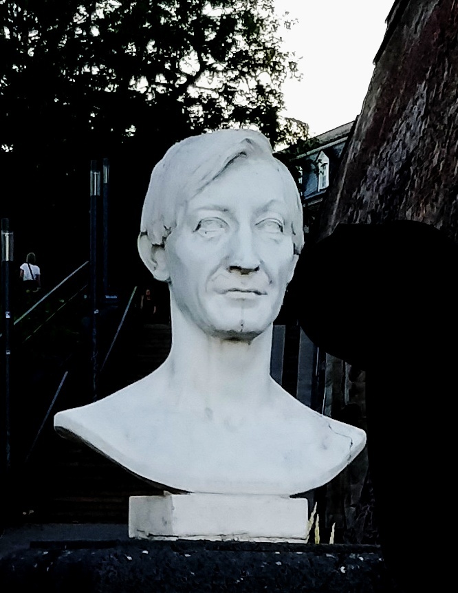
There is a new survey with some design proposals for the themes “European Culture” and “Rivers and Birds”.
You must log in or # to comment.
WTF why is just birds or people? These all suck. How very uncreative …
Things I could care less…
That means you do care.
- Weird Al - Word Crimes, listen to it!
Then why post at all?
Otherwise you wouldn’t know 😉
I would completely remove people and would add fish, plants and monuments.
The only thing is to make sure trump does not photobomb the session.
I am kind of in love with F and H.
F because it’s the only design that really tries to be differnet, fun and daring. I love the color combinations and how expressive they are. I am aware that this probably isn’t going to be the one that’s picked, but man, would it be cool it this was what the Euro looked like in the future.


H because they are, in my opinion the prettiest animal notes. Again, lively colors that are combines beautifully, and I like that they are horizontal. The tenner with the kingfisher is so pretty, I would frame it and put it on a wall.


I’m not voting, though, because I’m Danish and we still use our own currency. We probably will make the shift to Euroes someday, but until then, I don’t feel it’s appropriate for me to vote for the design of a currency that isn’t used in my country.
I don’t feel it’s appropriate for me to vote for the design of a currency that isn’t used in my country.

Why all the birds? We need at least a cat and a dog.
House cats are an invasive species that kill all the birds. Hardly an animal worth putting on a bill. Large cats were however once native to Europe, which is why you see so many lion crests, but putting that on there would hardly seem progressive.
Ok then we should have wild animals like squirrels, moose and beavers. There are so many beautiful animals in Europe. No reason to restrict the collection to birds only.
That, I can agree with. I don’t know why the picked birds.
Yeah they should’ve had different animals.
The most popular notes in Denmark were the ones with different animals. Pay me squirrel, I can’t give a fish back on your lizard.
Birds don’t belong to a single country or person, yet are very noticeable and something a lot of people can associate with.
That is true for many other wild animals too.
@Halcyon @Quittenbrot
What would you suggest? (Apart from cats & dogs, that aren’t wild.)(I would opt strongly for the essential honeybee.)
And at least to me, they symbolise freedom, and more specifically freedom of movement. They go wherever they want, whenever they want, with no restriction. And this is a fundamental idea of the EU.
Would be cool to put food on the bills. Imagine a bowl of spaghetti on the 200€ bill.
H and J for me. I prefer birds much more than people on the design and those two designs are actually colorful and distinct from the current more bland colors.
sound of german ballermann music
“I’m thirsty a Callas is not enough, a Curie won’t cure me, take my Cervantes, give me Cerveza”
sound of german ballermann music
I don’t understand why they included vertical designs and suddenly want pictures of real people on the banknotes when they used to say it is better to have something neutral on there. From the comment here I like B and D most, but I don’t know if the images from the comment are the same as the ones in the survey because I think there were more designs. Still B and D are worse than the current designs.
Birds! 🐦⬛
They’re very similar, either people, buildings or birds as main designs and feels boring as well as the designs being mainly ugly. Some are nice but don’t feel inclusive for all of Europe. I feel like the designs should be more generic to be inclusive of all countries, so no famous people or country-specific buildings/geography. I like the EU stars, constellations, the map of Europe, symbols of what Europe represents.
Birds are a pretty good motif because a small selection of them might already span the whole continent (don’t know if that’s specifically the case here), disregarding any borders. They also lack representation in a part of the world where people classify themselves mostly as either a dog or a cat person.
That they are similar isn’t surprising, the motifs for the two possible themes where selected by the ECB over a year ago.
I find the backsides with the EU buildings too self-praising. I think the European people have more things that unite, than the buerocratic institutions.
The backsides of the people bills are also too general, I would like to see more of the people’s work or achievements.
Generally I like the current design with fictional bridges and buildings, so no country is preferred.
I also think most of the back sides are just generally uninspired - bland, almost AI-like look, no interesting (or even aesthetic) themes. Many of the front sides I liked, so this is disappointing.
I don’t like the building at all. These are modern building which are not build for millenials.
The survey seems very AI. Anyway, I prefer the bird ones, though really they should just pick generic symbols again. The bridges and buildings worked just fine for this.
Series D reminds me of 90’s guilders, though, so I liked that one.
One of the stated design goals with the existing design is to make them as generic as possible so as not to show favouritism towards a particular country. If you asked me for famous European figures to put on the notes, I’d probably name Beethoven, Curie and Da Vinci, but by including them you’re highlighting a Germany, France/Poland and Italy. The building designs are boring but that’s not necessarily a bad thing. The birds are cute, but I’d like to have seen broader nature themes: birds, fish, mammals and biomes would have been nice.
I would have loved a fauna / flower note. Fauna being bird, fish, butterfly (palatable insect), reptile, whale, land mammal.
Bridges were a great idea and maybe other infrastructure like railroads and tunnels as a symbol of connecting countries.